- Blue Collar Contrarian
- Pages
- Here it is

Renewal by Anderson is one of the most effective direct mailers in the world.
Let's Break This Down.
Here are the ideas I stole from Renewal by Anderson to make my own million dollar mail piece.
Handwriting - this is a killer way to make it feel personal. Handwritten font isn't good enough. There are apps you can download like Goodnotes on your iPad, and handwrite your message over a pdf design to make your direct mail look legitimately hand written... because it is... and it can be printed to look extremely authentic.
It doesn't look like advertising. It looks like an actual handwritten estimate. This little tweak makes a HUGE difference. People think someone physically hand wrote it and dropped it off in their mail box.
The offer - there are several offers. See how the original price is scratched out? This is extremely effective.
"Good Until" - there is a deadline to this offer which gives it a sense of urgency.
The Call to Action - do you see it? "Call me to work you up a price" - that is the simple call to action.
Personal - it is the little things that matter, but everybody calling off of this flyer is asking for Bob... they think Bob left it there just for them and they are gonna call Bob back. And the smiley face. These little things matter.
Actors play the part - see all that fine print at the bottom? It kinda makes it look "official"... these pieces are not meant to maximize space or see what you can cram on it. See Bob's signature at the bottom? That was a nice touch. This is meant to look exactly like a real estimate even though it is mass produced.
Choreography -Make sure you put an actual sales persons name on the estimate. So when they call in... they can speak with Bob. It's not always possible. We have five sales people so I can't put all of there names on the flyers, but I do put the one who is most likely to answer the phone on the flyer.
Tracking - I guarantee you that the phone number on this piece is a tracking number. I like how it is highlighted too. I copied that as well.
The twist - the one twist is that I used this piece for EDDM instead of using a direct mail list. The postage cost is less than half of the bulk rate which means you can put out twice the volume for the same cost. We used #80 paper and just put the eddm postal insignia on the back of the piece.
The back (see below) - the back needs to look like an estimate. I know its tempting to put something on there, but don't. And see that random estimate number? It's made up, but we have customers call in referencing their estimate number. Most people never see the postage, but you can see it on the back flipped upside down. We do have some people call in complaining that we are putting these in there mailboxes by hand (which is a felony)... and usually we cannot convince them it was mass produced and legally placed there by a mail carrier.(I guess that means it looks really fucking authentic lol) If your direct mail doesn't elicit an emotional response, it probably doesn't work very well. Some complaints are a good indicator you are on to something.

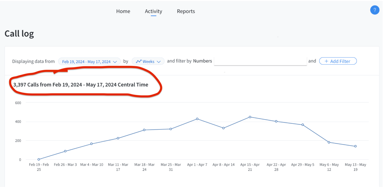
Don’t believe me?
Rarely ever do you get to see the actual results.
Check out the amount of calls we got.
And if you have a friend you think this can help. Share this link.
